01Problem
Café menus were PDFs. Guests scanned the QR code at night and found nothing they could read.
"I just wanted to know what the drinks were, but the PDF was too dark to read on my phone."
Field observation, Ladadika, Thessaloniki
- Goal 01Greek and English that never break the layout.
- Goal 02A dark, premium look that suits an evening café.
02What was built
- 01
QR first
Nothing to install: the QR code opens a category in under 2 seconds.
- 02
Bilingual by default
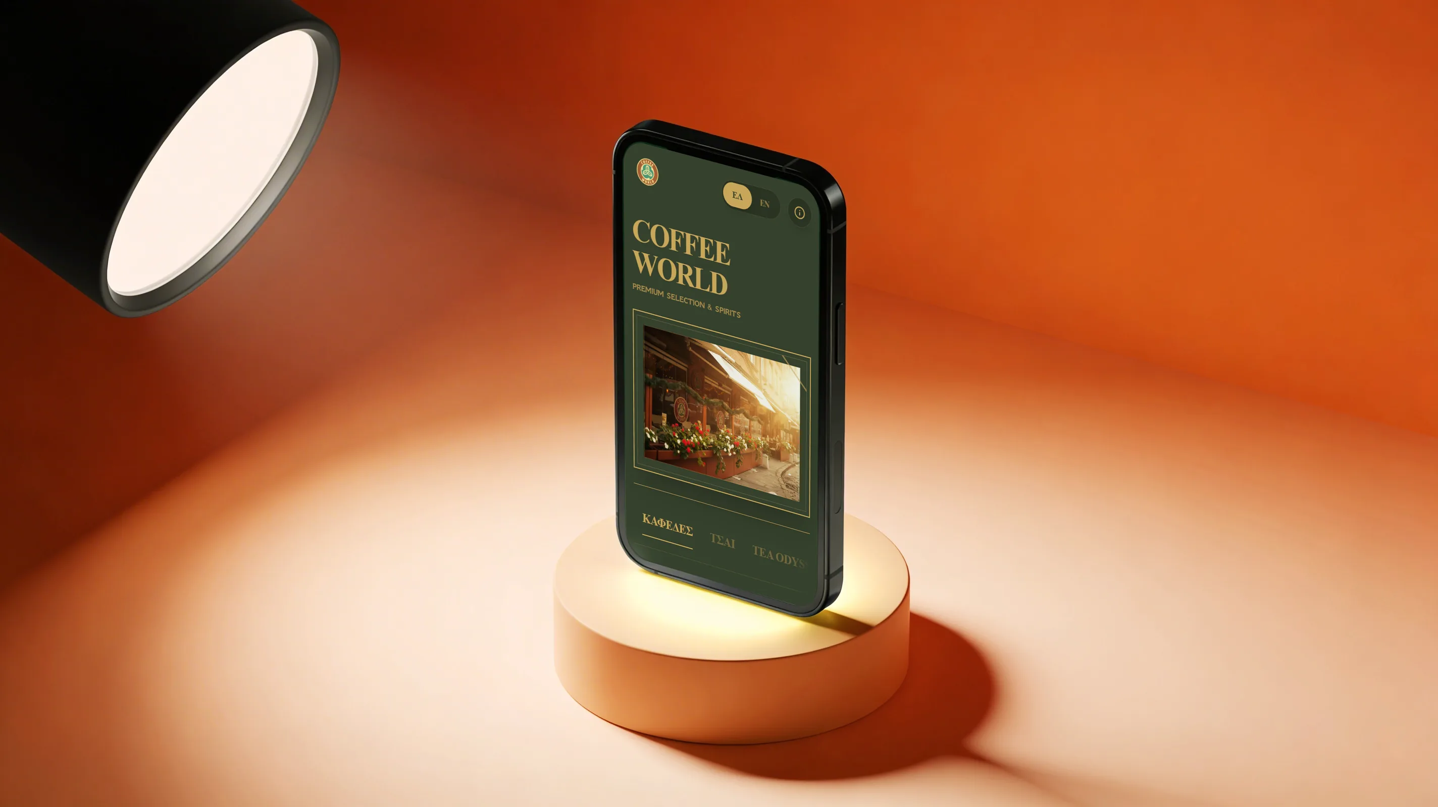
Every item and description exists in Greek and English, so neither reads as the translation.
- 03
Boutique dark
Deep forest tones and gold accents that match the room the menu is read in.
03Process
- 01
Field research
Time in the Ladadika café scene. PDF menus were the main friction for international guests scanning at night.
- 02
Information architecture
One flow: QR scan, category, item - under 2 seconds. The structure mirrors the physical menu.
- 03
Visual language
Deep greens, gold accents, Playfair Display for headlines and GFS Neohellenic for Greek body text.
- 04
Testing and refinement
A field test with one participant (Ioanna, 46): the look earned trust at once; the horizontal scroll cue needed a second pass.
04Principles
No manipulation
The menu lists what the café serves and stops there, without upselling or pushed specials.
Prices in plain sight
Every price is on screen from the start, with nothing hidden behind a tap.
Both languages first
Neither language is the afterthought.
Usable before beautiful
Every visual choice was checked against real use.
05Lesson
In a luxury café, a menu you can read at night on a phone is part of the luxury.
Open the live menu (opens the live site)